This Japanese interior inspired furniture store is the perfect example of how to take a Konigle template and make it completely yours. Mod Livin wishes to offer high quality minimalist furniture and a sense of an experiential and modern living, both of which are granted the same importance on the site, thanks to the use of components that result in an organized website layout. An FAQ page is also ready for answering visitors’ common queries right away.
Color scheme
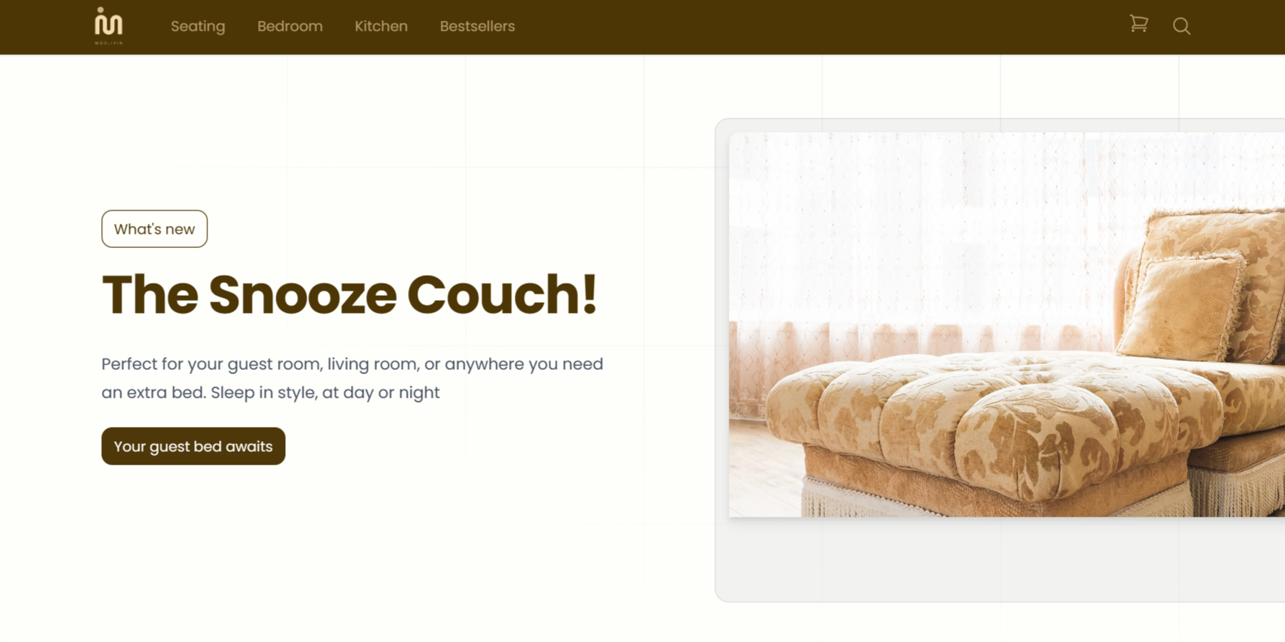
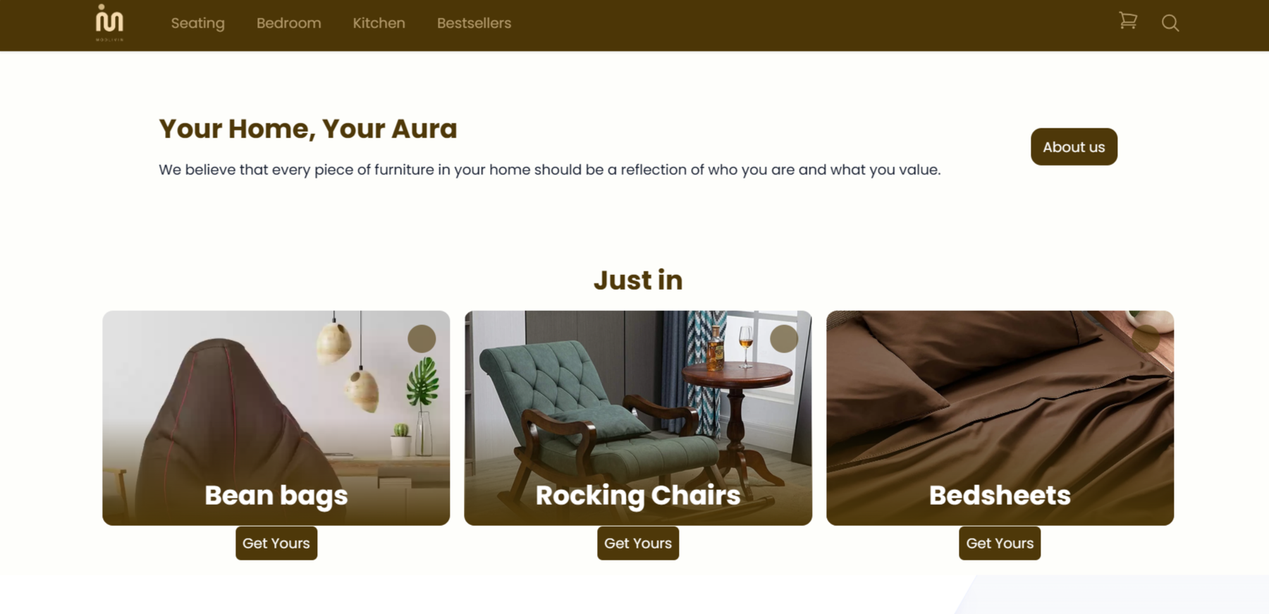
- Dominant Color: A rich chocolate brown was chosen as the dominant color. Brown exudes elegance, sophistication, and a sense of stability, perfectly aligning with the brand's focus on modern furniture.
- Accents: To prevent the website from feeling too dark, subtle accents of cream and gold were used. Cream adds a touch of warmth, while gold injects a hint of luxury.
Typography
- A clean, modern typeface named Open Sans was chosen for both headings and body text. This ensures readability and complements the overall minimalist aesthetic.
- Headings utilized a slightly bolder version of the font for better hierarchy and visual interest.
Imagery
- High-resolution product photos showcasing furniture in well-lit, uncluttered settings were used. This allows customers to clearly see the details and functionality of each piece.
- Lifestyle images featuring furniture integrated into stylish living spaces were employed. These inspire customers by demonstrating how the furniture can be used to create their dream home.
By utilizing these design principles, Mod Livin achieves a website that is both aesthetically pleasing and user-friendly. The elegant brown theme, high-quality visuals, and well-organized layout create a professional and sophisticated online shopping experience, effectively showcasing the beauty and functionality of the furniture.