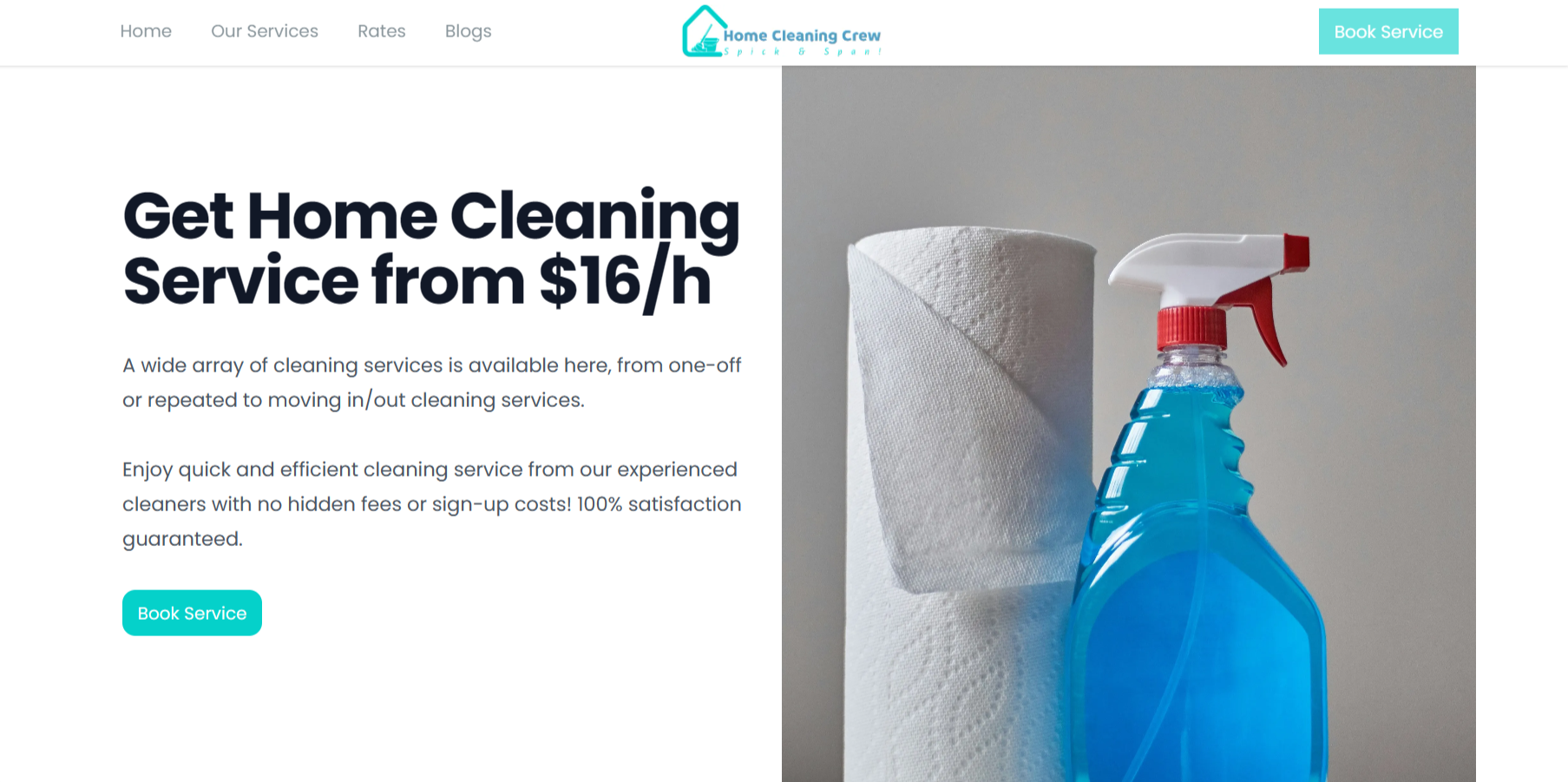
Straightforward and to the point, this website directly shows you what services they provide and how to easily book an appointment to avail such services. Browse their website and you’ll quickly be convinced that their a professional team of service providers, who have been booked all over Singapore.
Design Goals
- Create a calming and inviting atmosphere
- Showcase the services provided in a clear and concise manner
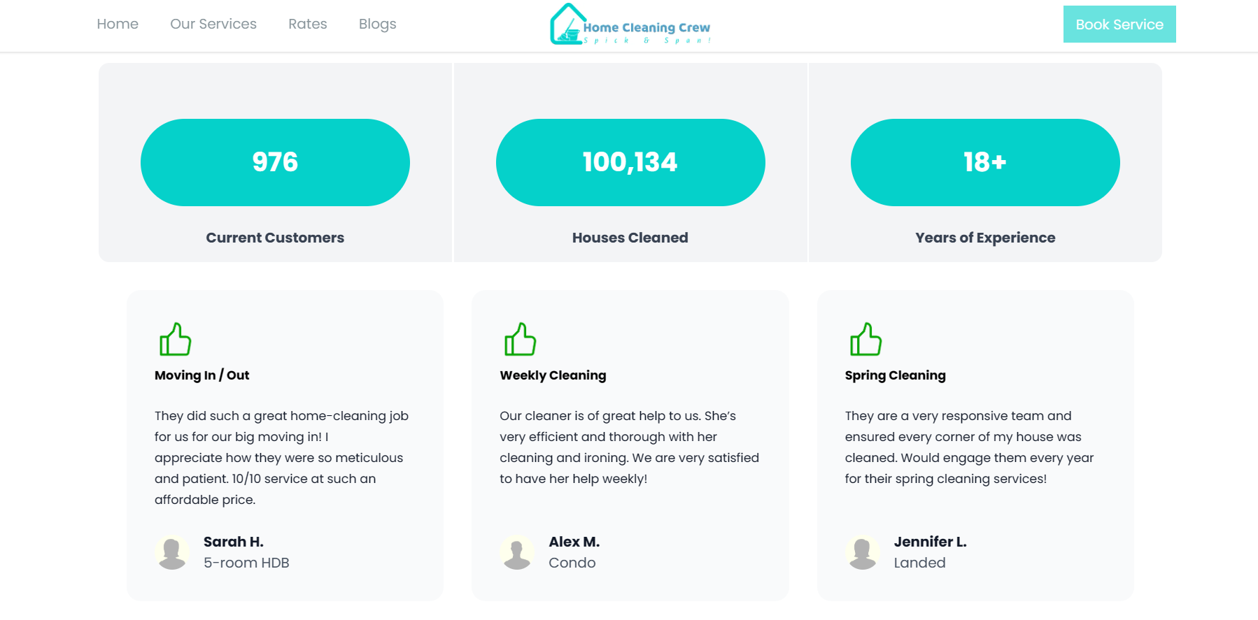
- Data visualization for impact

Key Design Principles
- Hierarchy & Balance: The layout prioritizes crucial information. Hero images with clear headlines grab attention, followed by detailed service descriptions and testimonials. Strategic white space balances content and prevents visual clutter.
- Color Psychology: The chosen teal blue evokes a sense of calm and cleanliness, perfectly aligning with the brand's services. Accents of white create a sophisticated and inviting feel.
- Imagery: High-resolution photographs showcasing sparkling kitchens, gleaming floors, and satisfied clients play a crucial role. These visuals instantly communicate the value proposition and build trust in the Home Cleaner's capabilities.
- Typography: A combination of a clean, professional Open Sans font for headlines and a modern, easy-to-read sans-serif font for body text ensures information is both visually appealing and highly legible.
- Microinteractions: Subtle animations upon hovering over elements add a touch of interactivity and guide the user's attention.