The striking colors and typeface choices, paired with an extraordinary body of work, make this one of the best websites designed on Konigle. In addition to showcasing examples of their best work in the various disciplines they specializes in, we decided to showcase what Sushi really means to us and create a compelling online experience.
Design Goals:
The goal was to create a website that reflects their commitment to quality, elegance, and a truly immersive dining experience. Translate the restaurant's ambiance and meticulous sushi preparation into the website's design.
Key Design Principles:
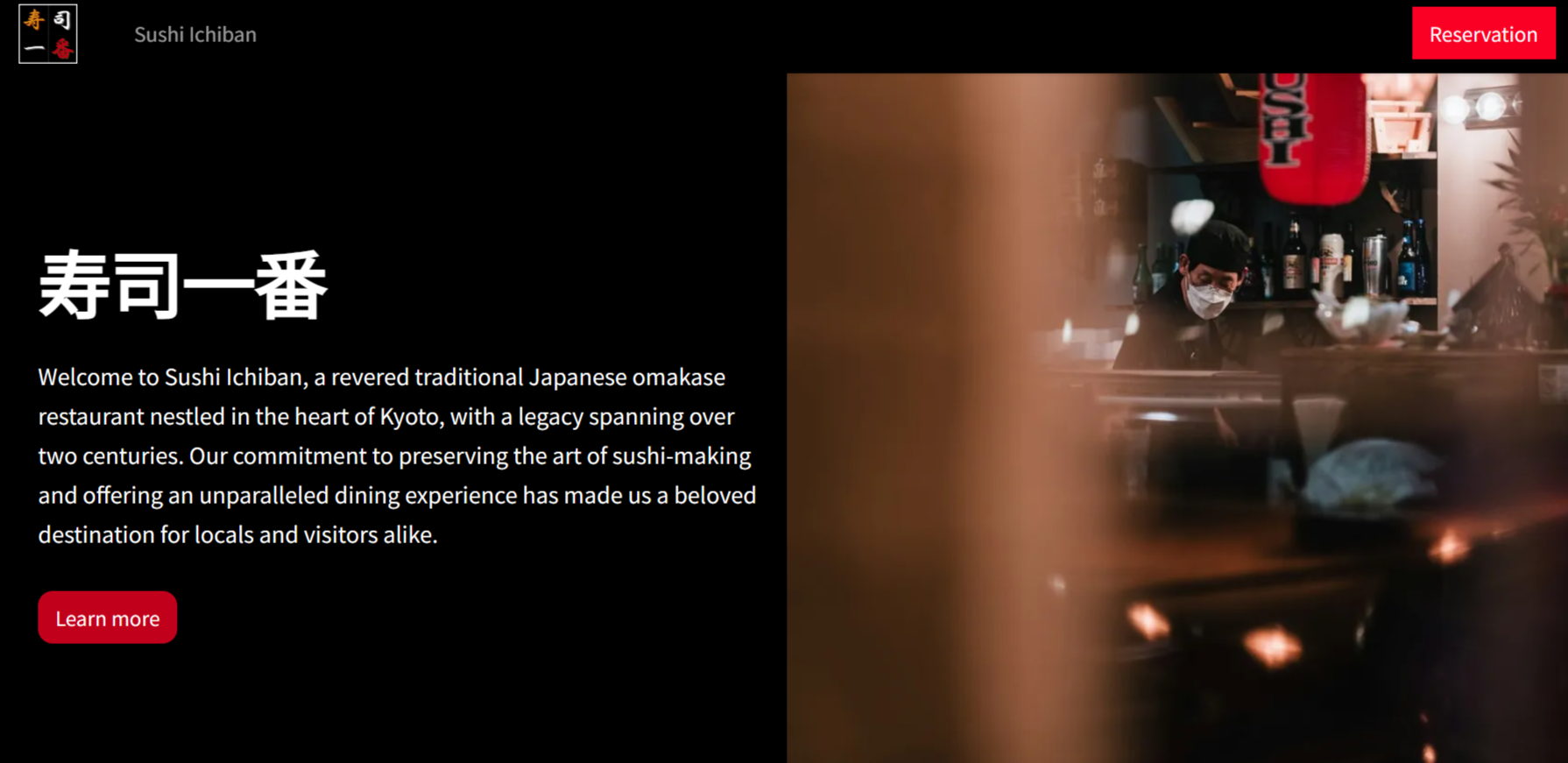
- Color Scheme: A bold black and red color scheme was chosen. Black signifies sophistication and luxury, while the red denotes freshness and the vibrancy of the sushi itself.
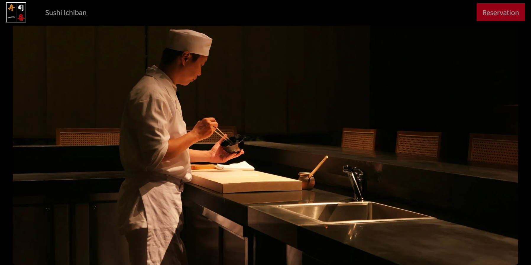
- Hero Section: A full-width video or high-resolution image showcasing chefs expertly preparing sushi pieces serves as the hero section. Your attention is then immediately drawn towards the Call to Action which stands out in a bold red colour.
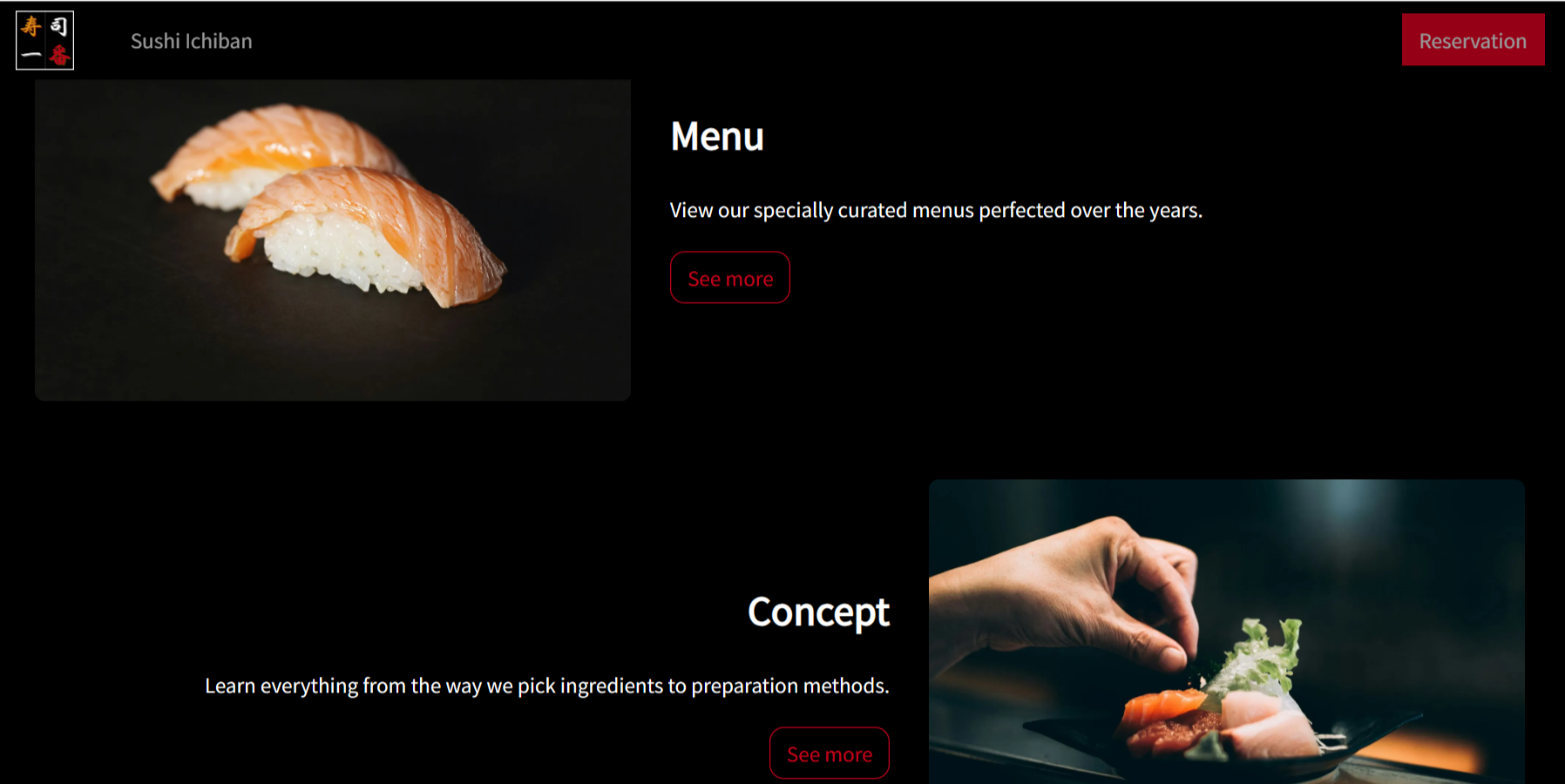
- Carousel Slider: A captivating carousel slider displays an array of mouthwatering sushi photographs with subtle transitions. This section highlights the variety and exquisite presentation of the menu.
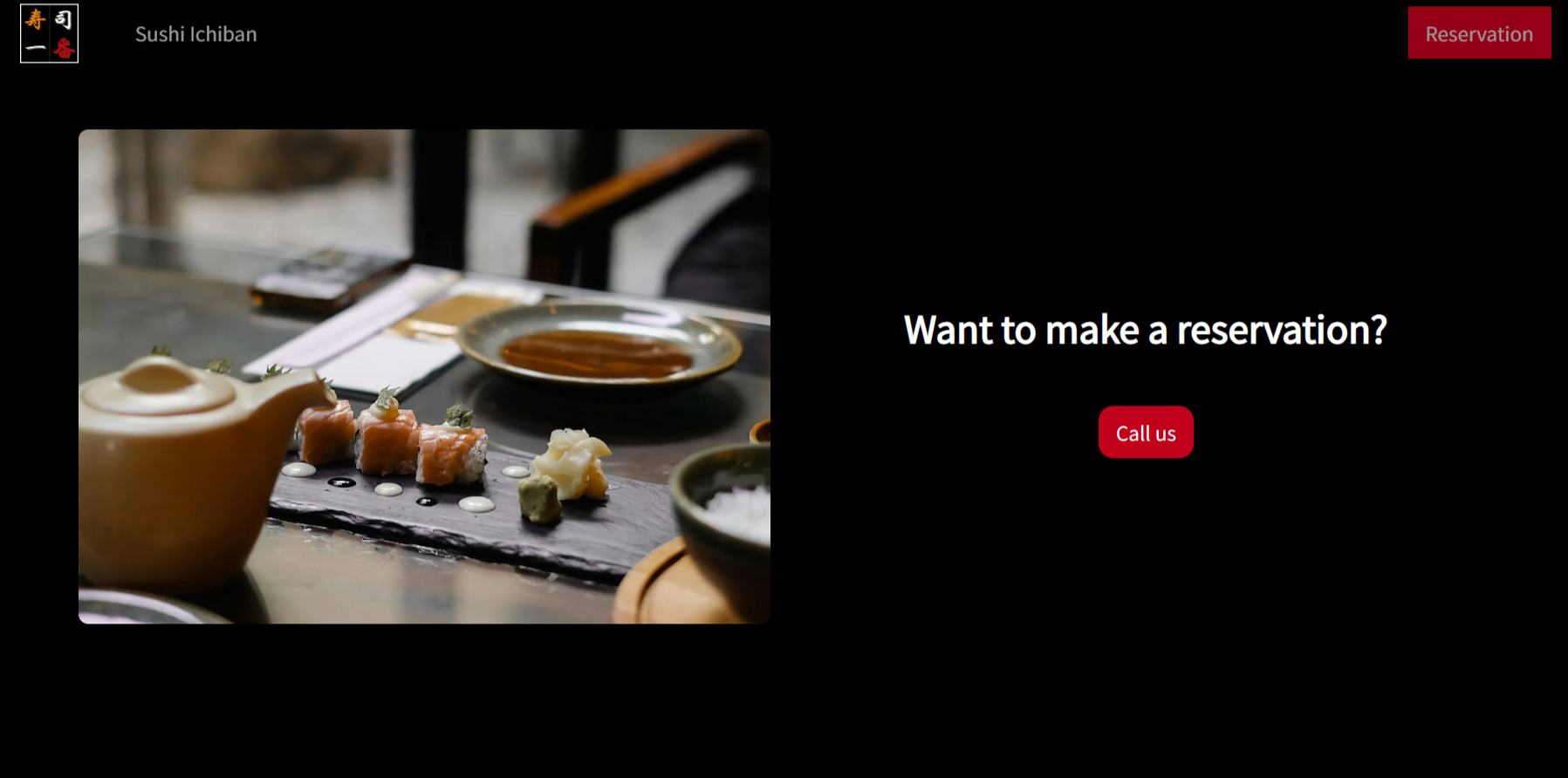
- Elegant Imagery: Throughout the website, high-quality photographs are used to showcase the restaurant's interior, signature dishes, and the artistry of sushi preparation.